Your company flag is one of the few brand assets that people see before they walk through the door, and a poorly designed one tells them everything they need to know about your attention to detail. Most corporate flags fail not because of bad logos or ugly colors, but because nobody accounted for wind, distance, and fabric — the three forces that turn a sharp digital design into an unreadable blur on a pole. Getting corporate flag design right is less about creativity and more about understanding what fabric can and cannot do at scale.
The Viewing Distance Rule That Should Drive Every Design Decision
Your brand manager spent three months perfecting a corporate flag design on a 27-inch monitor. The logo looked sharp. The tagline popped. Then they hung it on a 30-foot pole outside the office, and nobody could read a single word from the parking lot.
This happens more often than most companies admit. The gap between screen design and real-world flag visibility comes down to one principle: the 1-inch-to-10-feet rule. For every inch of text or logo height, you get roughly 10 feet of legibility. A 5-inch-tall logo reads clearly at 50 feet. That same logo at 100 feet? You need to double the size.
Here is where most corporate flag projects go wrong. Teams design at arm’s length, approve on a laptop, then print on a 5x8 foot flag meant for a 200-foot viewing distance. The math does not forgive optimism.
| Viewing Distance | Minimum Text Height | Logo Coverage |
|---|---|---|
| 50 feet | 5 inches | 15-25% of flag area |
| 100 feet | 10 inches | 20-30% of flag area |
| 200 feet | 20 inches | 25-35% of flag area |
Indoor flags get more design flexibility because viewers are closer. A desk flag at 10-20 feet can include taglines and secondary graphics that would vanish outdoors. But outdoor flags on 25-40 foot poles demand a brutal edit: strip everything except the logo and one dominant color block. No small text. No fine details.
The smartest move before any production approval? Print the design at full scale, tape it to a wall, and walk back to the expected viewing distance. If you squint, redesign. This five-minute test saves thousands in wasted prints.
Color Selection: Matching Brand Pantone to Flag Fabric Reality
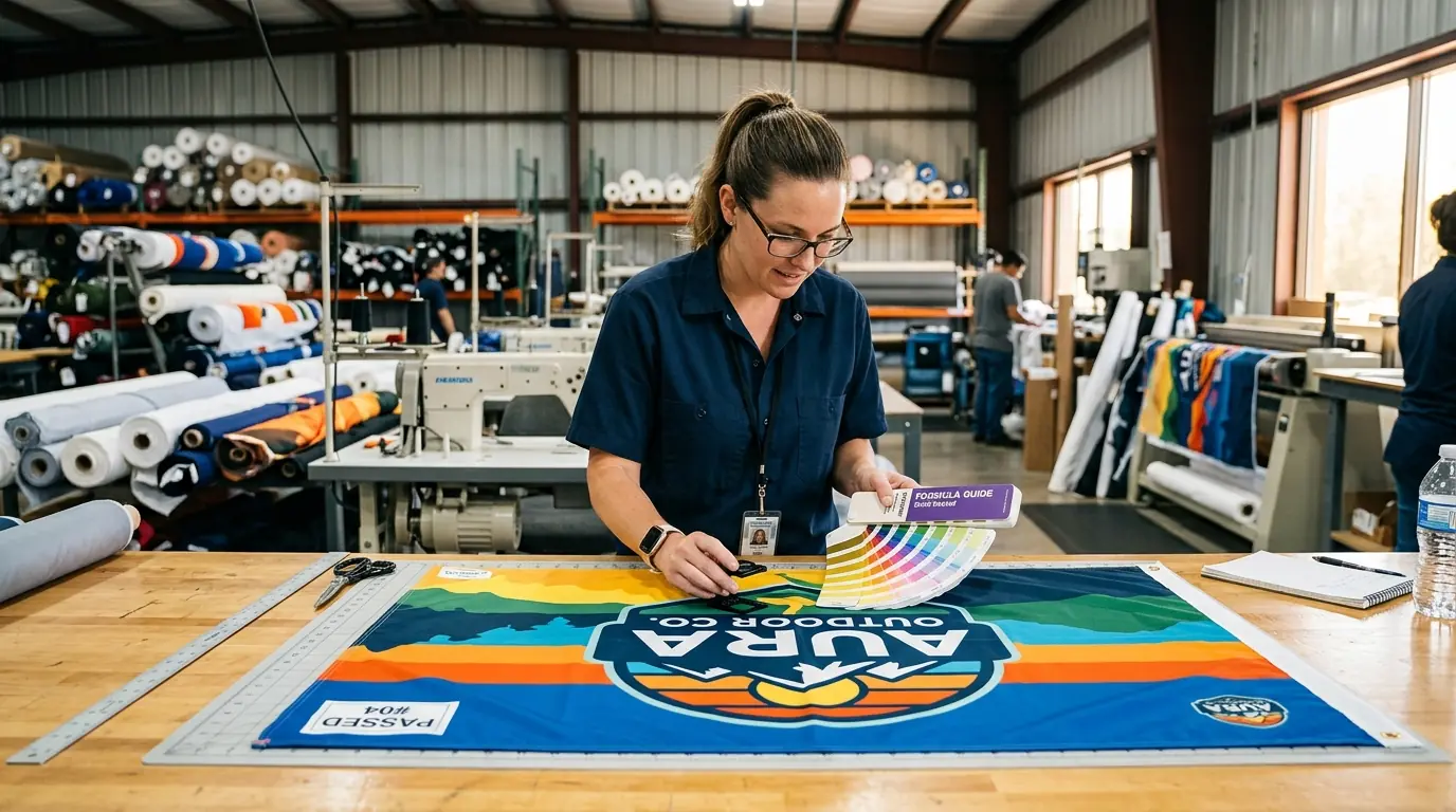
That perfect brand blue on your website will not look the same on polyester. Every marketing team learns this the hard way, usually after receiving 50 flags in a shade that does not match anything else in their brand ecosystem.
The fix starts with specifying Pantone Solid Coated (PMS C) numbers for every flag order. Uncoated swatches shift noticeably on polyester because the ink interacts differently with fabric surfaces compared to paper. Dye sublimation on white polyester can get close to an exact PMS match, but “close” depends on fabric whiteness, ink finish, and whether you are using a matte material like Ez-Tex or something slightly glossy like Dynatex.
Choosing between polyester and nylon is really a tradeoff between durability and cost. Polyester absorbs just 0.4% water versus nylon at 4%, dries faster, and resists UV fading significantly longer. A polyester flag lasts 6-12 months outdoors. Nylon? About 3 months under the same conditions. But nylon flies better in light wind and costs less upfront.
| Factor | Polyester | Nylon |
|---|---|---|
| UV color retention | Strong, minimal fading | Fades faster under UV |
| Wind performance | Best in high winds | Better in light breeze |
| Water absorption | 0.4% | 4% |
| Outdoor lifespan | 6-12 months | ~3 months |
Two background colors to reconsider: white and black. White flags look pristine on day one, then collect dirt, pollen, and pollution within weeks. Black fades to a washed-out charcoal under UV exposure. Neither is wrong, but both require more frequent replacement than mid-tone colors.
Before approving any production run over 10 units, request a physical strike-off — an actual printed fabric swatch. Digital proofs lie. Fabric tells the truth. That extra 3 business days of waiting beats reprinting an entire order.
Logo Adaptation: What Works on a Business Card Fails on a Flag
A logo that looks elegant on a business card can become an unreadable smear on a 5x8 foot flag whipping in the wind. The medium changes everything, and most brand guidelines were never written with fabric in mind.
The biggest adaptation challenge is orientation. Most corporate logos are horizontal, but many flag applications are vertical — feather flags, sail banners, teardrop displays. Simply rotating a horizontal logo 90 degrees creates awkward proportions and illegible text. The better approach is to isolate your brand icon from the full lockup, scale it to fill 60-70% of the usable flag area, and position it in the upper half where it stays visible even when the lower portion folds.
Fine details are the next casualty. Thin strokes under 3-4 points disappear in screen printing. Gradients flatten into muddy solid blocks once sunlight, shadows, and fabric movement get involved. The solution is not just enlarging the logo — it is simplifying it. Remove hairline outlines, drop subtle textures, and increase the weight of every remaining element.
For wordmark-heavy logos, increase letter spacing 10-20% beyond your standard brand guidelines. Fabric curvature and wind flutter compress letters visually, and extra spacing compensates for that distortion. Stick with thick sans-serif fonts in uppercase, and limit text to three words maximum on any flag.
The professional move here is creating a dedicated “flag-optimized” logo variant and adding it to your brand guidelines. Specify it as icon-only, limited to 2-3 high-contrast Pantone colors, with vector files in AI, EPS, and PDF formats. Include single-sided and double-sided placement notes plus safe margins from all edges to account for sewing and hemming.
Typography on Flags: Less Is Always More
Put a paragraph of text on a flag and you have created an expensive piece of fabric that communicates nothing. Flags are not brochures. They are billboards that move.
The maximum word count for any flag is 3-5 words for meaningful impact, though you can push to 6-8 words if the font is heavy enough and contrast is extreme. Past that threshold, you are fighting physics. Wind, distance, and fabric movement will win every time.
Font selection matters more on flags than almost any other brand application. Sans-serif fonts — Helvetica Bold, Futura Bold, Impact, Arial Black, Gotham — maintain legibility because their thick geometric strokes do not thin out or blur when fabric ripples. Serif fonts fail here. Those small decorative strokes merge together at distance and completely disappear when the flag folds. Script and decorative typefaces are even worse.
Where you place text on the flag matters as much as what the text says. Feather flags need key messaging in the upper half because the middle constantly folds over itself. Teardrop flags distort shapes at the rounded top, so place your primary element slightly below the curve. For standard rectangular flags, center-weighted or top-third placement gives the best visibility during natural drape.
One placement mistake shows up repeatedly: critical text near grommets or the hoist edge. These areas fold, bunch, and take the most physical stress. Any text placed there will be partially hidden most of the time and will wear out first.
Minimum font sizes to keep in your spec sheet: 7-9 inches tall for outdoor flags on poles, 1.5 inches for indoor table displays. If the text does not pass a distance test — readable across a room without straining — choose a bolder weight or remove the text entirely.
Single-Sided vs. Double-Sided: When the Extra Cost Is Worth It
The single-sided vs. double-sided decision is not about quality. It is about viewing angles, and most companies overspend by defaulting to double-sided when they do not need it.
Single-sided flags print on one fabric layer. The reverse shows a mirror image with about 60-70% show-through. Double-sided flags use three layers — two printed surfaces with a blocker fabric in between — so each side reads correctly and independently.
The cost difference is significant. Double-sided flags run roughly double the price of single-sided, not the 30-50% premium that some estimates suggest. That means a $200 single-sided order becomes $400 for double-sided. For a company ordering flags across 20 locations, the budget impact adds up fast.
Here is the decision framework that saves money without sacrificing brand perception:
| Scenario | Best Choice | Why |
|---|---|---|
| Outdoor pole flags | Single-sided | Flies better, lasts longer, adequate for most viewing |
| Entrance or median display | Double-sided | Viewers approach from both directions |
| Trade show backdrop | Single-sided | Typically viewed from one direction only |
| Parade or festival | Double-sided | Multi-directional audience movement |
| Indoor stationary display | Double-sided | Wind not a factor, both sides visible |
Weight affects performance more than most buyers realize. That three-layer double-sided construction makes the flag heavier, which means it needs a stiffer breeze to fly properly. In moderate wind, a double-sided flag may lay flat against the pole while a single-sided version waves freely. The extra weight also creates more whip stress on the fly end, shortening outdoor lifespan compared to a single-layer flag.
For roughly 90% of typical corporate flag situations, single-sided works. The human brain reads reversed text without much trouble — your logo and colors still register. Save double-sided for the situations where correct orientation from every angle truly matters.
Production File Preparation That Prevents Expensive Reprints
Getting the design right means nothing if the production files cause a botched print run. File preparation errors are the single most preventable reason for flag reprints, and they happen on nearly every first order from companies new to large-format fabric printing.
Vector files are not optional. Submit your design in AI, EPS, or PDF format. These scale to any flag size without quality loss. Raster files — JPG, PNG, even PSD — pixelate when stretched from a screen-sized graphic to a 36x60 inch flag. If your design includes photographic elements or raster components, they need to be at minimum 150 DPI at actual print size, though 300 DPI gives the cleanest results.
Bleed requirements catch teams off guard. The standard minimum is 0.5 inches on all sides, but large flags often need up to 8 inches for hem and finishing allowances. Keep all text and critical graphics inset 1-2.5 inches from every edge — sewing machines do not respect your carefully placed logo.
Color mode is where the most expensive mistakes hide. Designing in RGB and sending files without converting to CMYK produces unpredictable color shifts. Your brand’s signature red might arrive as something closer to salmon. For dye sublimation, convert everything to CMYK. For screen printing, specify Pantone spot colors directly. Never trust automatic conversion.
The errors that trigger the most reprints:
- Fonts not outlined or converted to paths (production machines substitute different fonts)
- Document sized in pixels instead of actual inches
- Heavily compressed JPGs with visible artifacts
- Missing Pantone specifications with no color reference
- Spelling errors caught after printing (more common than anyone admits)
One step that eliminates most of these problems: ask your flag vendor for their specific production template before starting the design. Every manufacturer has slightly different bleed zones, safe areas, and file preferences. Starting from their template costs you nothing and prevents the most common formatting errors.
Pro Tip: For bulk corporate flag orders over 100 pieces, contact our team for volume pricing and dedicated color matching.
Avoiding the Five Design Mistakes That Damage Brand Perception
Bad flag design does not just look unprofessional — it actively works against your brand. A cluttered, faded, or inconsistent flag hanging outside your building sends a message about how your company handles details. Visitors and customers notice, even if they never say it out loud.
Mistake 1: Cramming too many elements onto the flag. Flags need 40-60% negative space to function. Your logo, tagline, phone number, website URL, and QR code do not all belong on the same flag. That impulse to maximize the real estate creates visual noise that communicates nothing from any meaningful distance. Pick one primary element and let it breathe.
Mistake 2: Choosing the wrong fabric for the environment. An indoor-weight polyester flag hung outdoors on a 24/7 basis will shred within weeks. Nylon in a high-wind corridor will tear before the quarter ends. Match the fabric to the conditions: heavyweight polyester for harsh outdoor exposure, nylon for moderate climates with lighter wind.
Mistake 3: Brand color inconsistency across materials. Your flag colors should match your signage, website, and print collateral. Without Pantone specifications tied to every production order, each vendor interprets your “brand blue” differently. Test flag designs in grayscale too — if the design loses all meaning without color, the composition itself needs work.
Mistake 4: Designing for a static mockup instead of a moving flag. Every corporate flag design gets approved as a flat digital file on a screen. But flags are dynamic objects. They fold, ripple, wrap around poles, and drape limply on calm days. The only reliable test is printing a sample and observing it in actual wind conditions. Kraft Foods learned a version of this lesson in 2009 when their redesigned logo looked different in physical applications than it did in digital presentations.
Mistake 5: No flag-specific brand guidelines. Without documented standards, different departments and locations order flags with different designs, proportions, and colors. The result is a company that looks disorganized from the outside. Add a “flags and banners” section to your brand guidelines covering approved designs, standard proportions (2:3 or 3:5 ratios), material specifications, and approved vendors.
Building a Corporate Flag System Across Multiple Locations
Designing one great flag is a project. Managing consistent flag displays across 5, 20, or 100 locations is a system — and most companies do not build one until they have already created a mess.
Start with a flag matrix. Map every flag type (corporate logo, seasonal, event-specific, departmental) against every location (headquarters, branch offices, retail stores, trade shows). Track which version is deployed where, its condition, and when it was last replaced. A shared spreadsheet works for small operations. Companies with more than 10 locations should consider a DAM platform like Bynder or Adobe Experience Manager that supports version control and role-based access.
Vendor consolidation makes or breaks color consistency. Limit flag production to one or two approved vendors who have your complete brand specification package — Pantone colors, vector logo files, production templates, and quality benchmarks. Every additional vendor introduces color drift. Annual reviews comparing output quality across vendors catch problems before they multiply.
Template-based reordering prevents the most common multi-location error: someone at a branch office deciding to “improve” the flag design. Pre-approved designs stored in your asset management system mean reorders go through a portal with locked templates. The branch manager picks a size and quantity, not a new color scheme.
Set replacement schedules by location and environment. Outdoor polyester flags in moderate conditions last 6-12 months. High-wind or high-UV sites need replacement every 1-3 months. Indoor flags can go years between replacements but should still be inspected for dust accumulation and color consistency during annual brand audits.
The flag system pays for itself in reduced waste. Companies without one tend to discover mismatched, faded, and off-brand flags during executive visits — leading to rushed emergency orders at premium pricing. A scheduled replacement calendar turns that reactive scramble into a predictable line item.
What to Do This Week
Stop evaluating your corporate flag design on a monitor. Print it at scale, tape it to a wall, and walk 50 feet back. That single test will tell you more than any design committee meeting.
If you are starting from scratch, tackle these three steps first: create a flag-optimized logo variant (icon-only, 2-3 colors, no fine detail), specify your Pantone Solid Coated numbers for every color, and request a physical fabric strike-off before approving production. These three actions eliminate the majority of corporate flag design failures.
For companies managing flags across multiple locations, build the system before ordering the next batch. Document your flag specifications in your brand guidelines, limit your vendor list, and set a replacement calendar. The difference between a company that looks polished and one that looks neglected often comes down to whether anyone owns the flag program.
Your corporate flag is permanent outdoor advertising. Treat the design process with the same rigor you would give a billboard campaign — because that is exactly what it is.
Video Guide
Related Articles