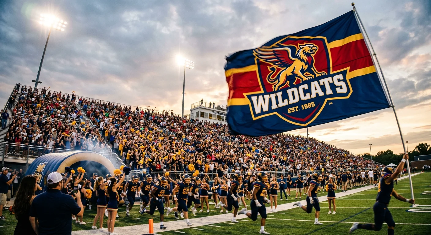
Every great stadium moment has a flag waving above it. Before the walk-off home run, before the buzzer-beater, before the championship pile-on at midfield — there's always a sea of colors rippling through the stands. Those colors are stitched with symbols that mean something much deeper than wins and losses.Design cues from these legendary banners are often referenced by custom iconic sports team flags manufacturers when developing large-format supporter flags meant to replicate the same stadium-scale visual impact.
The most iconic sports team flags in stadium history aren't just merchandise. They're battle standards. They carry dynasty bloodlines, city pride, and shared memories that hit you in the chest the moment you see them.
This countdown covers ten flags that went beyond the game — NFL team flags , soccer supporter flags , baseball stadium banners , and more. Each one shows what it really means to design something worth standing behind.
Study them. You might find the inspiration to build one of your own.
New York Yankees Flag — The "NY" Monogram That Defined Baseball Royalty
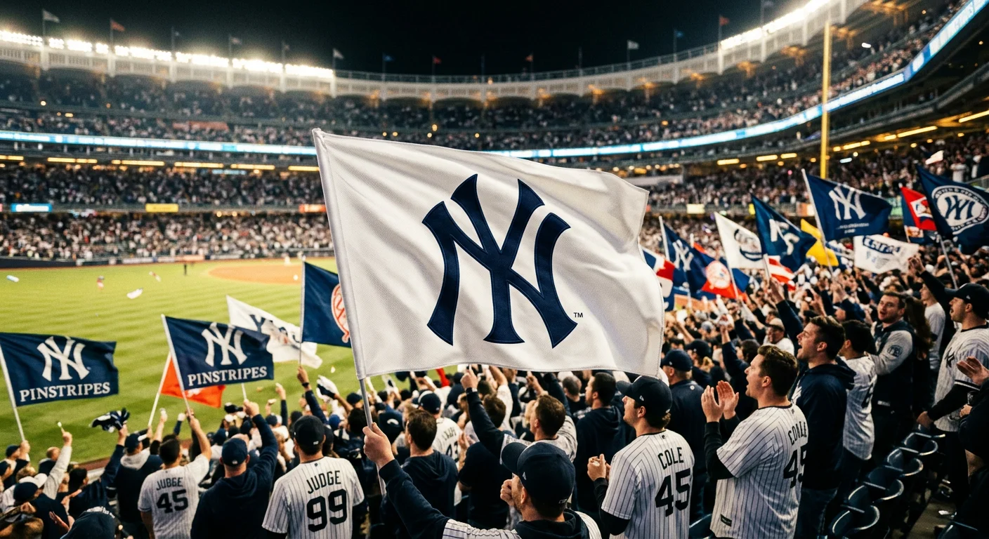
The interlocking "NY" didn't start on a baseball diamond. It started with a gun, a saloon, and a cop doing his job.
In 1877, designer Louis B. Tiffany created the "NY" monogram for an NYPD Medal of Valor. The medal went to patrolman John McDowell. He made an arrest during a saloon robbery on January 8th of that year. The design showed interlocking letters above a silver shield, framed by a laurel wreath. It honored courage. No one imagined it would one day fly over a baseball dynasty.
The Yankees picked up the mark in the early 1900s. Owner William "Big Bill" Devery — a former NYPD chief himself — brought that law enforcement history with it. By 1909 , the interlocking logo sat on caps and left sleeves. By 1922 , it locked into the now-iconic solid navy cap with white "NY." That same cap worn by Ruth. Gehrig. DiMaggio. Mantle.
What makes this mark extraordinary isn't reinvention — it's the refusal to reinvent. The core design has held for over 115 years without a meaningful overhaul. That kind of stability is almost unheard of in professional sports.
Yankees fan flags carry that same confidence:
Classic white field with the centered "NY" logo — clean, direct, impossible to misread
Horizontal tricolor — pinstripes above and below a navy center panel, "NY" cutting across all three bands
Commemorative editions marking all 27 World Series titles , from 1923 to 2009
These aren't novelty items. Each one is a portable monument to a franchise that took a police department's medal of honor and made it the most recognized sports logo on earth — from the Bronx to Beijing.
That's what a baseball stadium banner can carry when the design behind it has real meaning.
Chicago Bulls Flag — How a Red Bull Became the Symbol of a Dynasty
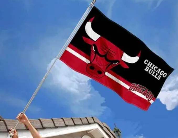
Dick Klein was hungry for something brutal.
The Chicago Bulls' founder commissioned a logo in 1966. He didn't want something sleek or corporate. He wanted blood. He got it. Designer Dean P. Wessel pulled from Klein's raw inspiration — Chicago's meatpacking industry, the brutal energy of slaughterhouses, the old Chicago Packers' bull logo. What came out looked like it wanted to fight you. A red bull head, black-outlined, nostrils flared, brows furrowed hard. And on the horn tips? Klein pushed for it himself: red blood droplets .
That's not branding. That's a declaration.
The design specs tell the whole story:
Red bull head — aggression, passion, controlled fury
Black face details and outlines — mystery, toughness, zero softness
White horn outlines — sharp contrast that cuts through arena lighting at United Center from 200 feet away
Bold serif typography — uppercase "CHICAGO BULLS," set in Stymie Black, placed in a two-line layout between the horns for pure dominance
Then Michael Jordan walked through the door in 1984. Six championships followed — 1991, 1992, 1993, 1996, 1997, 1998. The 72-win 1995–96 season. The logo didn't change once. It didn't need to. Every title banner made that red bull carry more weight, more history, more meaning.
That's 58+ years of the same design. Zero major redesigns.
NBA team flags wave from the upper deck. Most fade into the background. Bulls flags don't. That red-black-white palette was built for aggression. It reads like a threat from the nosebleeds. The unchanged logo carries Jordan's ghost in every thread.
Some sports fan banners represent a team. This one represents a standard.
Dallas Cowboys Flag — The Lone Star That Became "America's Team" Icon
The star was drawn before the Cowboys ever played a single game.
Equipment manager Jack Eskridge sketched it in 1960. It was a solid dark blue five-pointed star, helmet-ready, and franchise-defining before the franchise had a history to define. Four years later, he refined it. He added a white outline and a dark blue contour to stop it bleeding into the new blue helmets. That version? Still on the helmet today. Still on the flag today. Untouched for over 60 years.
That's not inertia. That's conviction.
The design logic is refreshingly simple:
Five-pointed star, clean symmetry, zero gradients — it scales from a helmet decal to a 160-foot video board without losing a single line
Navy blue + silver/white — Texas sky above, Texas land below
No wordmark required — the star stands alone and everyone knows who it belongs to
The lone star isn't arbitrary. It mirrors the white star on the Texas state flag — the same symbol Texas carried through independence, through its brief run as its own republic, and into statehood. Eskridge didn't create the iconography. He borrowed it from 150 years of Texas identity and put it on a football helmet.
The name itself went through three versions before it landed. First came Dallas Steers — a cattle reference nobody loved. Then Dallas Rangers — killed by a naming conflict with the local baseball team. "Cowboys" stuck in 1960, and the lone star locked in behind it.
"America's Team" Changes What a Flag Means
Most NFL team flags sell within a 200-mile radius of the stadium. Cowboys flags don't follow that rule.
The "America's Team" label didn't come easy. It was built through decades of national television dominance, 5 Super Bowl titles , and a fanbase spread across all 50 states. That history turned this flag into something bigger than regional loyalty. You'll find it at political rallies, international fan meetups, and entertainment events with no sports connection at all. The star needs no explanation in any of those rooms.
AT&T Stadium in Arlington puts everything on full display. Capacity sits at 80,000 , expandable past 100,000. The HD video board stretches 160 feet wide — one of the largest on earth. On game day, the Cowboys star doesn't appear on a flag. It inhabits an entire building.
That scale is why Cowboys sports merchandise flags work differently from standard football team pennants . The logo keeps things simple — solid star, no complex detail, no fine-line printing requirements. Production costs stay low. Cultural demand stays high. Two forces drive it: Texas regional pride on one side, national "America's Team" identity on the other. No other NFL franchise pulls from both at the same time.
The star that started on a police medal became baseball's most famous logo. The star that started in an equipment room became football's.
Arsenal FC Flag — A Century of the Cannon Shield Waving Over English Football
Munitions workers don't birth sporting dynasties. Not often, anyway. But in 1886, men walking out of the Woolwich Arsenal Armament Factory formed a football club — and stamped a cannon on everything it touched.
That cannon never left.
The earliest crest showed three north-pointing cannons , matching Woolwich's own coat of arms. By 1922, the design shrank to a single east-facing cannon. Cleaner. Harder. More permanent. Then came 1949. A red shield rose behind the cannon, carrying the Latin motto "Victoria Concordia Crescit" — Victory Through Harmony . That postwar Arsenal squad had held opponents to 32 goals across 42 games. The shield felt earned.
Over 120 years , that cannon sat through 13 league titles and 14 FA Cups. Today at Emirates Stadium — 60,704 seats packed in — 187 documented supporter flags from 150+ official groups still fly it on match day.
Sports team flag factory workers built it. History made it permanent.
Las Vegas Raiders Flag — The Pirate Shield and the Birth of "Raider Nation"
The name "Raiders" almost never happened.
An Oakland Tribune contest in April 1960 picked the winner: Oakland Señors . Nine days later, organizers dumped it. Too many jokes. Accusations of a fix. They went back to the ballots. Third place was Oakland Raiders . A franchise identity was born from a runner-up.
The original logo fit that messy origin perfectly. It showed a full pirate — eye patch on, crossed sabers with yellow handles, leather helmet strapped tight. Aggressive from the first sketch. Some say the design was modeled on actor Randolph Scott .
By 1963, the yellow was gone. Black and silver-gray took over — cleaner, harder, more serious. The pirate stayed. The shield stayed. The team moved across Oakland, spent 12 seasons in Los Angeles , came back to Oakland, and now plays in Las Vegas. That core image never changed.
Three cities. One logo. That's not coincidence. NFL team flags built around real iconography outlast every relocation debate. Raider Nation didn't follow a city. It followed a pirate.
Kansas City Chiefs Flag — The Arrowhead That Makes Arrowhead Stadium Shake
Seventy-six thousand people. One arrowhead. A noise level that has registered on seismographs.
That's Arrowhead Stadium on a Chiefs game day — and the flag flying above it didn't get there by accident.
The arrowhead was never meant to be subtle. It points forward. Hard-edged. It carries the full weight of Kansas City's football identity in a single geometric shape. Red and gold. No softness. No apology. You can read it from the upper deck in a split second — and it means one thing only.
Chiefs flags come in every format built for stadium use:
3x5 ft
Standard Rally Flag
0.56 lbs, hand-waving
8.5x2.5 ft
Tall Flag
11.5 ft pole, section-visible
22x13 in
Metal Version
Permanent display-grade
12.5x18 in
Garden Flag
Small footprint, full statement
But the number that defines Arrowhead's flag culture? 150.
The Arrowhead Stadium Flag Moment
On September 11, 2011, 150 people carried a single American flag across that field. It stretched 150 feet wide and 300 feet long. It weighed over 1,100 pounds, spread across 14 sewn panels.
That moment showed what this stadium does with flags. It doesn't wave them. It deploys them.
The arrowhead earned that stage.
San Francisco 49ers Flag — Gold Rush Legacy Woven Into Every Thread
Gold fever built San Francisco. In 1849, men crossed deserts and oceans chasing it. The 49ers didn't name themselves after a football concept. They named themselves after a raw, all-in human drive — the kind that bets everything on one chase. The flag carries that weight in every thread.
That gold isn't decorative. It's a statement.
The construction backs it up:
3x5 ft Standard
100% polyester, 150-denier thickness -- built for outdoor punishment
Quadruple-Stitched Fly Ends
Stadium winds don't negotiate, and neither does this flag
Brass Grommets on Canvas Header
Hardware that outlasts seasons
Screen-Printed Logos, Visible Both Sides
No dead angle in the stands
Licensed by the NFL. Select deluxe editions use USA-made polyester. You can get started at $29.95 — solid value for the tailgate lot, and tough enough for a permanent pole.
Five Super Bowl titles live inside that red and gold. The flag doesn't need to announce them. The colors say it straight, the way a true dynasty always does.
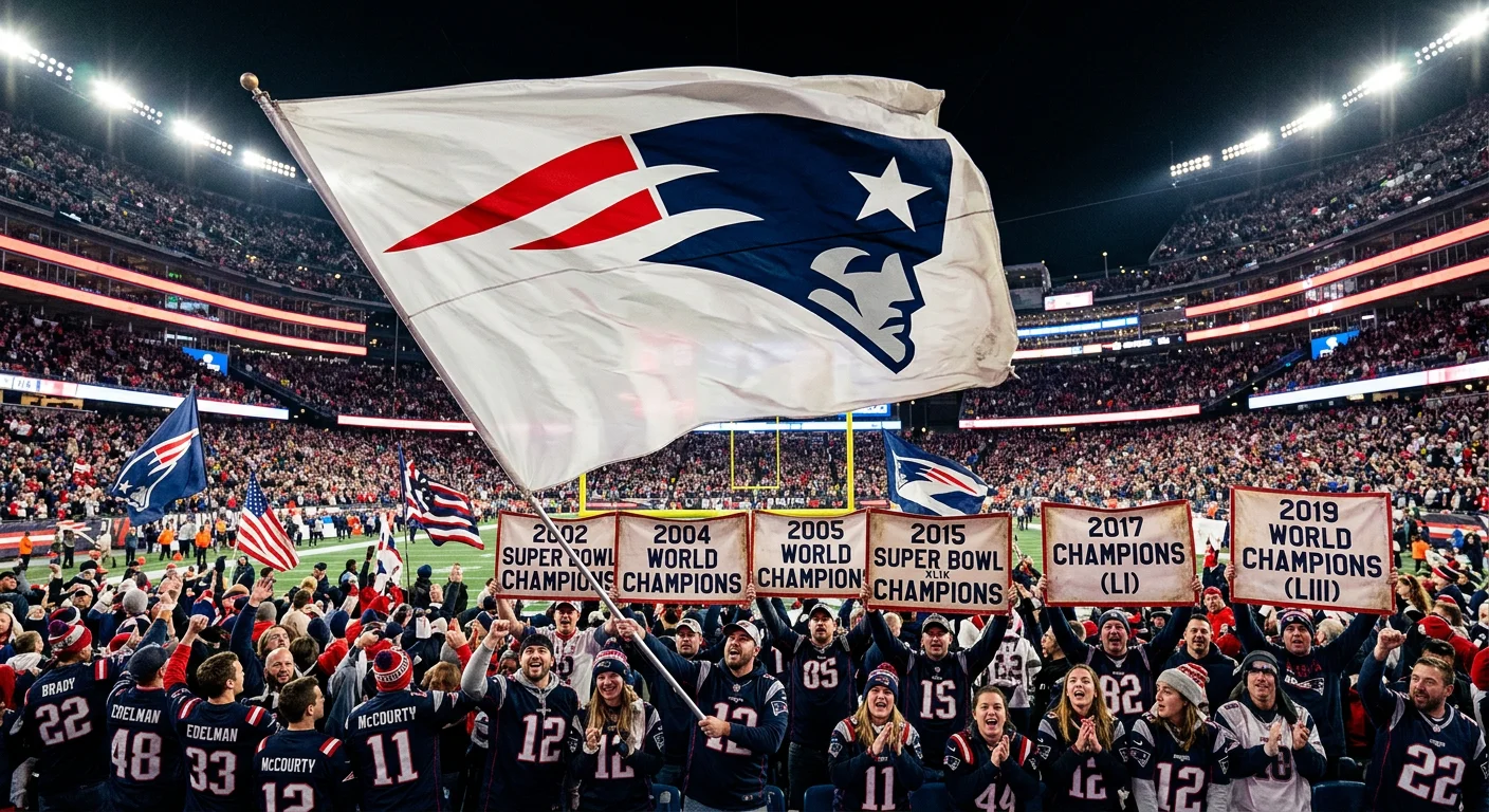
New England Patriots Flag — Six Super Bowl Championships Behind One "Flying Elvis"
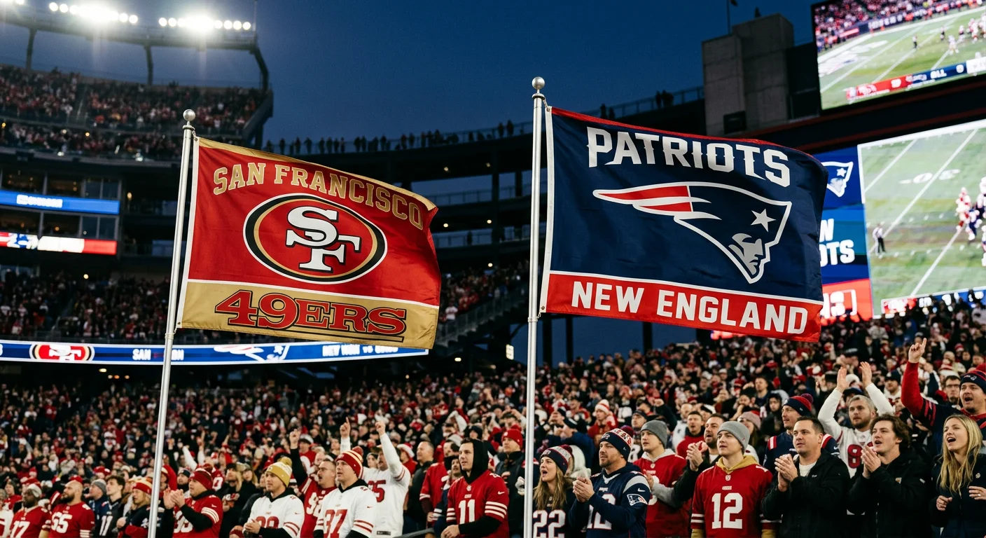
Six Super Bowl titles. One helmet silhouette. And the whole thing started with an intern's sketch.
The Patriots' "Flying Elvis" logo didn't come from decades of brand evolution. It came from a problem. The old logo — Pat Patriot , a detailed Revolutionary War soldier — was a merchandising nightmare. Too complex to print on hats, flags, and jerseys at scale. So in 1993, the organization gave a creative brief to Stan Evenson through NFL Properties. Evenson led the project. But the original sketch? That came from Ken Loh — an intern.
Loh's task was clear: design a clean patriot profile. It had to stand on its own — not borrow from the simpler 1979 soldier concept that marketing director Micéal Chamberlain had proposed years earlier. What Loh delivered was a sharp hybrid. A sleek side-view helmet in navy. A white star and facial outline cutting across it. Red stripes trailing behind like a flag caught in wind. Fast. Bold. Built for a football team, not a history textbook.
That's "Flying Elvis." The nickname caught on right away. Nobody has ever called it anything else.
The design reads sharp on a stadium flag:
Navy helmet profile — solid foundation, stays clear at any distance
Red trailing stripes — movement built right into the logo shape
White star and outline — contrast that holds under every lighting condition
Six championships flew under that mark — 2002, 2004, 2005, 2015, 2017, 2019 . The logo never changed across any of them. An intern's draft became a dynasty's standard.
Chicago Cubs Flag — How the "C" at Wrigley Field Outlasted a 108-Year Championship Drought
A shipping company's flag became baseball's most powerful piece of cloth.
The "W" didn't start at Wrigley. It goes back to 1884 — the Wilmington Transportation Co., a Los Angeles harbor freight operation. They flew a white "W" on dark blue. William Wrigley Jr. bought Santa Catalina Island in 1919 for $3 million. He took over Wilmington's fleet and got that flag along with it. Cubs spring training moved to Catalina from 1921 onward. Players rode Wilmington vessels to the island. That flag snapped overhead the whole way.
By 1937, P.K. Wrigley planted it above the center field scoreboard. White flag up: Cubs win. Blue flag up: Cubs lose. Simple as a telegram. Brutal as the truth.
Then came 79 years of blue flags.
2016 broke the 108-year drought. The W didn't just go up — it detonated . Airport employees raised it at O'Hare. It showed up on skyscrapers downtown, on front porches, outside corner stores. Advertising Flag Co. — the Cubs' sports team flags supplier for 40 straight years — called it their #1 top-selling item that season . Over 3,000 additional flags were produced in 2017 alone.
The design never needed updating. The wait made it permanent.
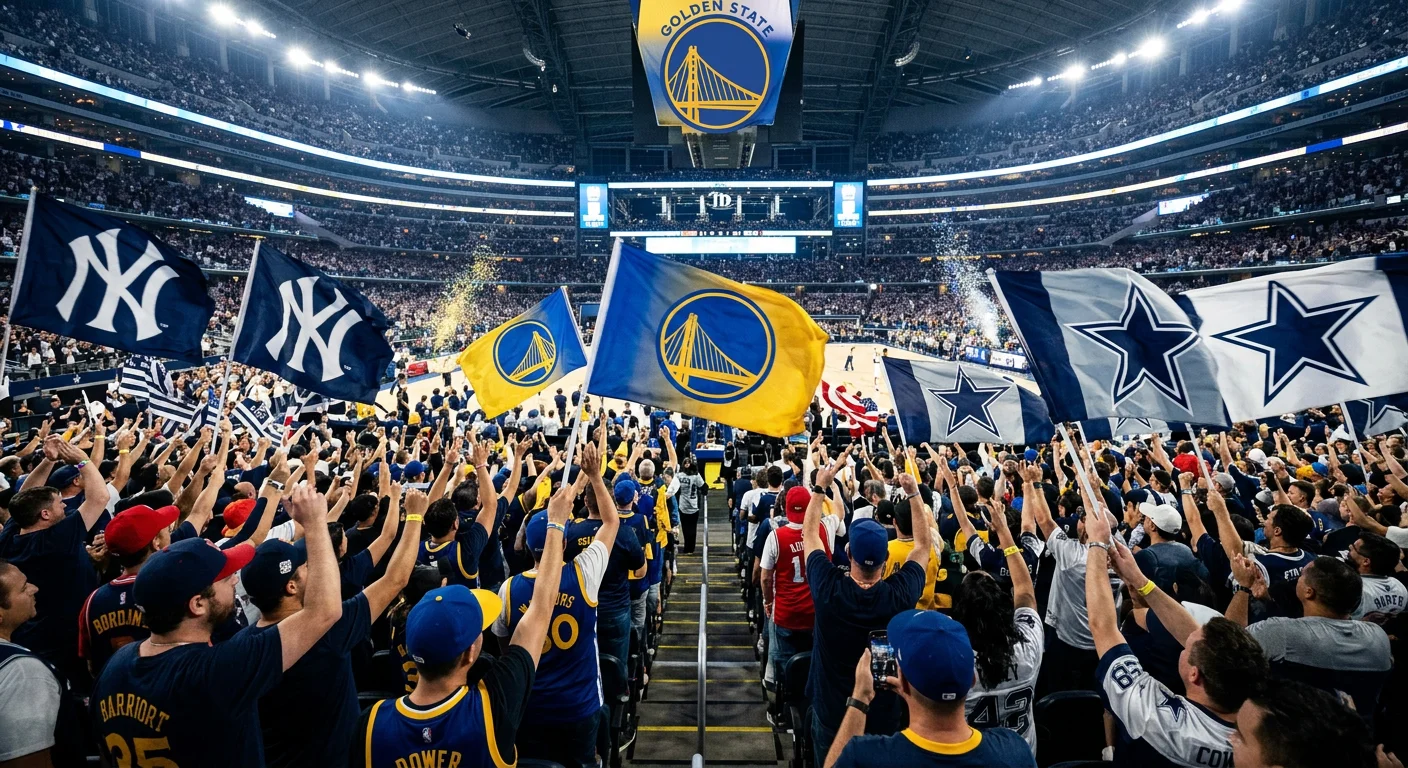
Golden State Warriors Flag — The Golden Gate Bridge and "The City" Identity
San Francisco doesn't let you forget where you are. The Warriors understood that in 1969.
The franchise redesigned its logo after moving west. No abstract symbolism. Just the Golden Gate Bridge — straight across a bold yellow medallion, outlined in deep blue. The message was clear: we belong here . Not just by location. By culture.
That bridge wasn't decoration. It was a statement of ownership.
The 1975 championship run told the whole story. Rick Barry led an underdog squad that swept the favored Washington Bullets. That win locked the image into Warriors history for good. Championship banners carrying that logo said one thing: Bay Area basketball could shock the world.
The 2019 update sharpened everything. Richer royal blue. Warmer gold. The Golden Gate redrawn with clean, precise yellow lines — no rough edges, no guesswork.
Then November 2024 took it further. The City Edition uniforms featured bridge rivets running the full length of the side panels. The font drew from the actual Golden Gate nameplate. Names of the bridge's construction workers got embedded right into the lettering.
Sports fan banners don't usually carry that level of detail. This one does.
Blue and gold haven't shifted in decades. Neither has the bridge. That's the point — some identities don't need reinvention. They need reinforcement.
How to Design Your Own Iconic Sports Team Flag: A Custom Flag Buyer's Guide
Ten flags. Ten different cities, sports, and eras. Look at them side by side — the design logic is nearly the same across all of them.
A dominant central symbol. Two or three colors, max. High contrast. Nothing small, nothing fussy.
The "NY" works at 200 feet because it's bold and uncluttered. The arrowhead reads from the upper deck because it's a single hard-edged shape against a clean field. The Flying Elvis travels well because the lines are sharp and the palette is tight. These aren't accidents — they're principles. And they're the same principles that should drive your own flag.
The Design Rules That Matter Most
60-70%
Central Icon Coverage Area
2-3
Maximum Colors for Contrast
PMS
Pantone Locked Colors
Start with your central icon. It should occupy 60-70% of the visible area -- not tucked in a corner, not competing with text. A logo that disappears when the flag moves is too small or too detailed. Thin strokes and fine textures break apart at distance. Tight gaps between elements do the same in motion. Bold and simple wins every time.
Color discipline matters just as much. Two or three colors. High contrast — light on dark, or dark on light. Lock them to Pantone (PMS) values so your red stays your red across every production run.
Sizing, Materials, and Real Costs
3x5 ft
20 ft Pole
Stadium & Sideline
4x6 ft
25 ft Pole
Longer Sightlines
5x8 ft
30 ft Pole
Open Field & Rally
For most stadium and sideline use, 3x5 ft on a 20 ft pole is the standard choice. Need longer sightlines? Step up to 4x6 ft on a 25 ft pole. Open field or rally use? A 5x8 ft on a 30 ft pole commands space.
Plan your budget with clear numbers. Base pricing for small quantities runs $20–$100 per flag depending on size and finish. For a detailed breakdown, see our guide on how much a custom flag costs. Double-sided construction adds 20–50% to the cost. Worth it if your flag faces a crowd from both directions.
The ordering process is simple. You upload your design, select size and material, choose hardware, and review a proof. Production runs one to seven days before shipping.
The flags on this list took decades to earn their place. Yours starts with one clean design decision.
FAQ: Everything Sports Fans Ask About Stadium Flags
Two types of stadium flag questions exist. The ones you ask before you buy. And the ones you wish you'd asked before security turned you away at the gate. Here are answers to both.
What materials hold up in a stadium environment?
Short answer: nylon or polyester, full stop. Our outdoor flag material guide covers this in detail. Both handle wind loads up to 60 mph without shredding. Reinforced edges on either material last five or more seasons of consistent outdoor use. Anything lighter is a tailgate flag, not a stadium flag.
How big can a stadium flag get?
The upper limit is a football field. The Big Flag -- deployed at Super Bowls, NCAA championships, and MLB World Series events -- runs 100 yards by 50 yards. That's 45,000 square feet of fabric covering an entire playing surface. For fan sections, custom iconic sports team flags scale down to a practical 50x30 ft. Standard rally flags run 3x5 ft or 4x6 ft, depending on your pole setup.
Can you bring a large flag through the gates?
NFL and MLB policy is clear: no poles longer than 6 feet, no flags larger than 4x6 ft when unrolled. Get there early. Security inspections happen. A flag that took three hours to sew doesn't belong in a security bin. Some venues run their own rules -- Yankee Stadium, for example, allows large displays during soccer matches with separate flag protocols. Check the specific venue policy before game day.
Are custom NFL team flags legal?
Licensed flags purchased through NFL Shop are cleared for any use. Unlicensed custom sports team flags made for personal use or fan groups sit in a gray zone. Teams tolerate them at events. Just don't build a resale operation around them.
What do bulk orders cost?
Orders of 50 units or more pull 20-40% off the per-unit price. A standard 3x5 ft nylon flag at $30 per unit drops to $18 at bulk volume. Fan clubs, supporter groups, and organizations equipping an entire section see that savings add up fast. It's a real difference in your budget.
Conclusion
Every flag on this list tells the same story: the best sports team flags aren't decoration — they're declarations. The Yankees' "NY" monogram. The Warriors' golden bridge silhouette. The designs that last are built around something real — a city's identity, a dynasty's pride, a fanbase's deep loyalty.
That's the standard worth chasing.
Rallying a youth league? Running a supporters' section? Building a brand around a team people believe in? Your flag is the first thing people see and the last thing they forget. The NFL team flags and soccer supporter flags on this list didn't get here by chance. Each one was designed with clear purpose and intention.
So don't settle for generic. Design your own custom flag at RunCustomFlag.comand build something your fans will still be waving decades from now.
The best flags haven't been made yet. Make yours.
Video Guide
Related Articles