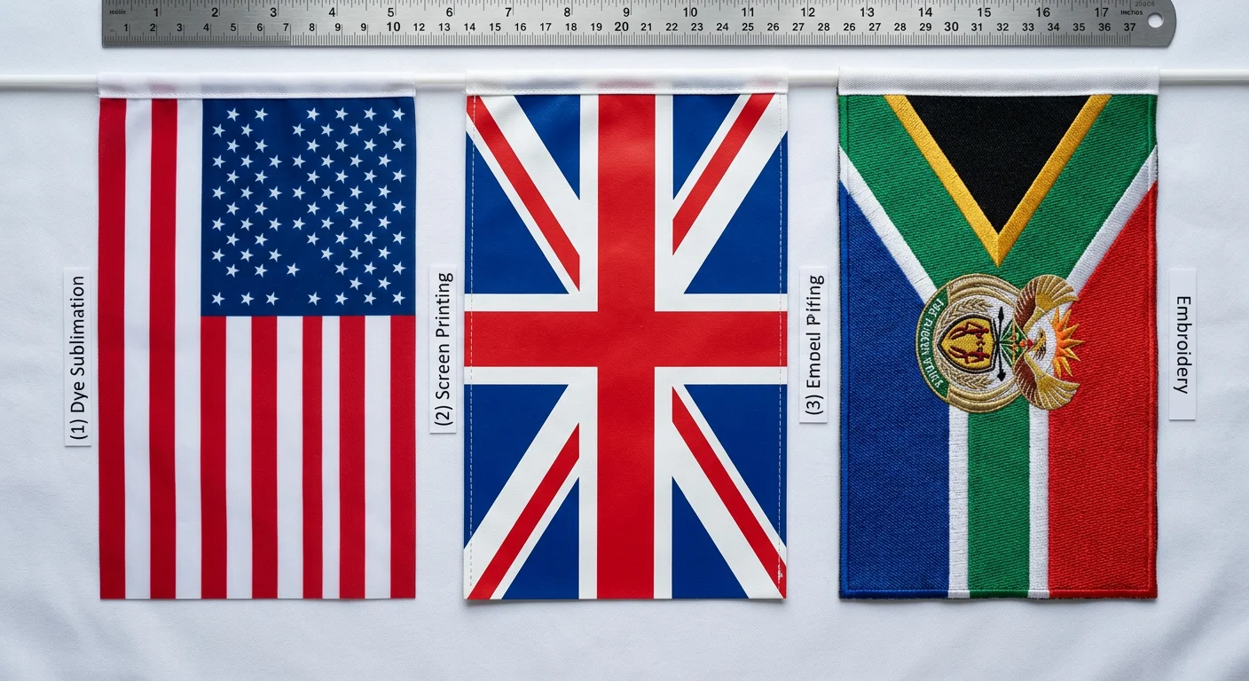
What Makes Sublimation Different from Every Other Printing Method on Fabric
Most flag printing methods put ink on top of fabric. Screen printing layers it through stencils. Heat transfer vinyl literally glues a cut sheet onto the surface. Direct-to-fabric inkjet sprays pigment that sits in a coating. They all share the same fundamental weakness: the color is a separate layer that eventually cracks, peels, or fades because it was never part of the material.
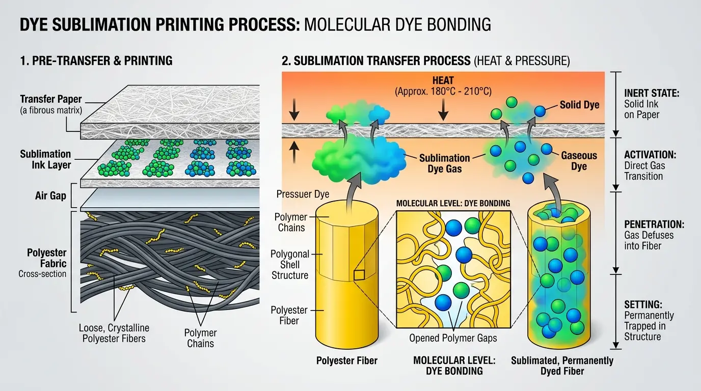
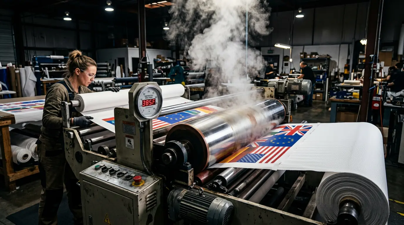
Dye sublimation skips all of that. The ink transitions directly from a solid to a gas under heat — around 385–400°F — and that gas penetrates the polyester fibers at the molecular level. When the fabric cools, those fibers contract and lock the dye inside permanently. There is no surface layer to degrade. The color is the fabric.
Key Distinction
Other methods put ink on the fabric. Sublimation puts color inside the fabric at the molecular level — making it permanent and impossible to crack, peel, or rub off.
That distinction matters more than it sounds. A screen-printed flag starts losing sharpness after a few weeks outdoors because UV and wind erode the ink sitting on the surface. A sublimated flag holds its color for months because there is nothing sitting on the surface to erode. The trade-off is material restriction: sublimation only works on polyester. Cotton, nylon, natural fibers — none of them have the polymer structure that opens under heat to accept the dye gas. If someone offers you "sublimation on cotton," they are either using a polymer coating (which defeats the purpose) or they do not understand the process. For a full breakdown of how flag materials and printing methods compare, that page covers the trade-offs across fabric types in detail.
Preparing the Digital File — Where Most Color Problems Actually Start

A surprising number of color accuracy complaints trace back to the file, not the printer or the press. The file stage is where the damage gets baked in, and it is the cheapest stage to fix.
Resolution is straightforward: 150 DPI at full print size works for most outdoor flags viewed from a distance. If the flag will be seen up close — a trade show tabletop flag, for instance — push to 300 DPI. Below 100 DPI, text edges start looking soft enough to notice.
Quick File Specs
Outdoor flags: 150 DPI min
Close-up display: 300 DPI
Color mode: RGB (not CMYK)
Ink system: CMYO
Color mode is where people get tripped up. Sublimation workflows use RGB, not CMYK. The printing system actually runs on CMYO — cyan, magenta, yellow, and a clear overcoat rather than black — so a CMYK file forces a color conversion that shifts tones in unpredictable ways. If your designer delivered a CMYK file, convert it to RGB before sending it to the RIP software, and expect some adjustment. ICC profiles matched to your specific printer and media combination handle the heavy lifting, but they cannot fix a file that started in the wrong color space.
One detail that catches first-timers: the design must be printed as a mirror image onto the transfer paper. The paper gets placed face-down on the fabric during heat transfer, so the image flips to its correct orientation. If someone forgets to mirror, every piece of text comes out reversed. RIP software handles this automatically when configured correctly, but it is worth verifying on a test print before running a full batch. Understanding the full custom flag production process helps set the right expectations before files are ever submitted.
Printing Sublimation Ink onto Transfer Paper
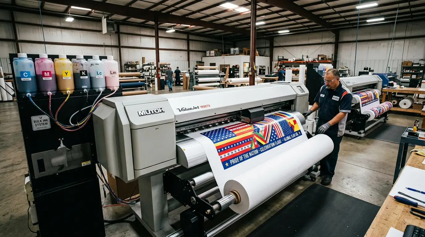
The transfer paper is not just a carrier — it is an active part of the color system. Its coating controls how much ink gets absorbed, how fast it dries, and how completely the dye releases during heat transfer. Cheap paper with inconsistent coating is one of the most common causes of blotchy, uneven saturation on the finished flag, and it is also one of the hardest problems to diagnose because the print on the paper always looks dull.
That dullness is normal and expected. Sublimation inks sitting on transfer paper look washed-out and underwhelming — nothing like the final result. The dyes are inert at room temperature. They only activate and show their full vibrancy when heat converts them to gas during the transfer phase. If you are evaluating a print shop and they show you a transfer that looks muted, that is correct. If it looks vibrant on the paper, something is wrong with the ink or the coating.
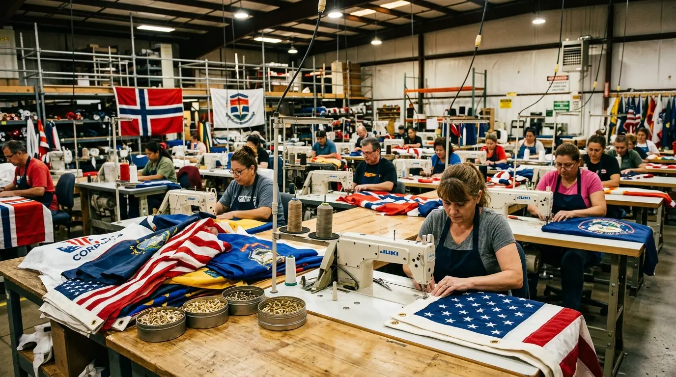
For commercial flag production, paper weight typically falls between 105 and 117 gsm. Lighter papers (under 95 gsm) work for high-speed printers with lower ink loads, but heavy ink coverage — the kind you need for full-bleed flag designs — demands heavier stock that will not cocke or warp. The printer hardware matters less than people think. An Epson SureColor, a Mimaki, a Roland — they all produce comparable output when paired with quality sublimation ink and properly profiled. The bottleneck is almost always the paper and the ICC profile, not the machine. This matters especially for large-format applications like banners and large format prints, where ink coverage across wide widths magnifies any inconsistency in paper coating.
Heat Transfer — The 60 Seconds That Determine Everything
This is the step where the process either works or fails. Temperature, pressure, and dwell time all have to land within a narrow window, and the margin for error is smaller than most people expect.
The benchmark for standard polyester flag fabric: 385°F, 50 seconds, medium pressure. That combination produces consistent, fully saturated color on most 110 gsm knitted polyester. But "medium pressure" is vague on purpose — it depends on the equipment, the fabric weight, and whether you are using a flatbed press or a calender roller system for large-format flags.
385°F
Temperature
50s
Dwell Time
Med
Pressure
110g
Fabric GSM
Temperature precision is the single biggest variable. Drop below the activation threshold and the dye does not fully convert to gas — colors come out faded and washed-out, and no amount of post-processing fixes it. Go too hot and you scorch the polyester, which yellows the fabric and degrades both color and structural integrity. A heat press thermometer is not optional equipment; relying on the machine's built-in gauge alone is how you end up with inconsistent results across a production run.
Before placing the transfer paper, pre-press the fabric for 3–5 seconds at target temperature. This step removes moisture trapped in the fibers, flattens wrinkles that would distort the design, and burns off surface sizing. Skipping the pre-press is the single most common cause of ghosting — that faint, blurry secondary image that ruins an otherwise clean print. Moisture in the fibers turns to steam during sublimation, and that steam displaces the dye gas before it can bond properly.
After the press cycle, let the fabric cool completely before peeling the transfer paper. Pulling it early — even by a few seconds — risks incomplete color transfer because the polyester fibers have not finished contracting around the dye. Patience at this stage costs nothing and saves reprints.
Why Polyester Is Non-Negotiable
Sublimation's polyester dependency is not a preference — it is physics. Polyester fibers are synthetic polymers that expand under heat, creating microscopic openings for the dye gas to enter. When the fabric cools, those openings close, trapping the dye permanently inside the fiber structure. Cotton's cellulose fibers do not expand the same way. They lack the polymer chain structure that makes this gas-phase bonding possible.
For flag production, 100% polyester is the standard. Poly-rich blends above 65% polyester will sublimate, but the colors lose saturation in direct proportion to the non-polyester content. A 70/30 poly-cotton blend produces noticeably duller output than pure polyester, and the cotton component also limits your maximum press temperature — above 370°F, the cotton fibers start scorching.
🏳️
75D Knitted
Best wind drape for feather and pole flags
🌈
110 GSM Knitted
Higher dye density for vibrant colors
📷
Satin Weave
Sharpest detail for photographic designs
The fabric construction affects the result more than most buyers realize. A 75D knitted polyester — the standard for feather flags and pole-mounted flags — prints well and drapes naturally in wind. A 110 gsm knitted polyester absorbs more dye due to higher fiber density, producing more vibrant colors, but it is heavier and flies less freely. Satin weave polyester gives the sharpest detail reproduction for photographic or fine-line designs but feels different in hand. The choice depends on whether you prioritize color vibrancy, wind performance, or image detail — you cannot maximize all three simultaneously.
One limitation that surprises people: sublimation inks contain no white. White areas in a design are simply the unprinted fabric showing through. Dark-colored polyester cannot be sublimated to produce accurate colors. Starting material must be white or very light. This is one reason why choosing the right fabric matters as much as the printing process itself — a detail covered in depth on the flag materials and printing guide.
Single-Sided vs Double-Sided Flags
Single-Sided
- 70-80% bleed-through vibrancy
- Lighter weight, better wind flow
- Lower cost per unit
- Longer outdoor lifespan
Double-Sided
- Correct readability from both sides
- Blockout liner eliminates bleed-through
- Heavier, more wind resistance
- Best for indoor and trade shows
Single-sided sublimation is the default for outdoor flags, and for good reason. The dye bleeds through the fabric to the reverse side, creating a mirrored image at roughly 70–80% of the front-side vibrancy. For most pole-mounted outdoor flags — where wind flips the fabric constantly — that bleed-through is perfectly functional. The flag is lighter, catches wind better, and costs less.
Double-sided becomes necessary in one specific scenario: when text or a logo must read correctly from both directions. Indoor trade show flags, hanging banners, high-visibility event displays — these need both faces to show the design in the right orientation. The standard approach is sewing two separately printed panels back-to-back with a blockout liner between them, eliminating all bleed-through. Some manufacturers use single-ply blockout fabric with embedded light-blocking threads, which is lighter than the sewn method but still heavier than a standard single-sided flag.
The durability trade-off is real and often overlooked. Double-sided flags carry more weight and catch more wind resistance, which means they wear out faster outdoors. If your primary use is outdoor pole display, single-sided lasts longer. If both-side readability is a hard requirement, accept the shorter lifespan or plan for more frequent replacement. For sports and event flags that need to read clearly from the crowd on both sides, double-sided construction is typically the right call.
Pro Tip: For bulk flag orders over 100 pieces, contact our team for volume pricing and dedicated production scheduling.
Quality Control — Reading the Signs Before They Become Problems
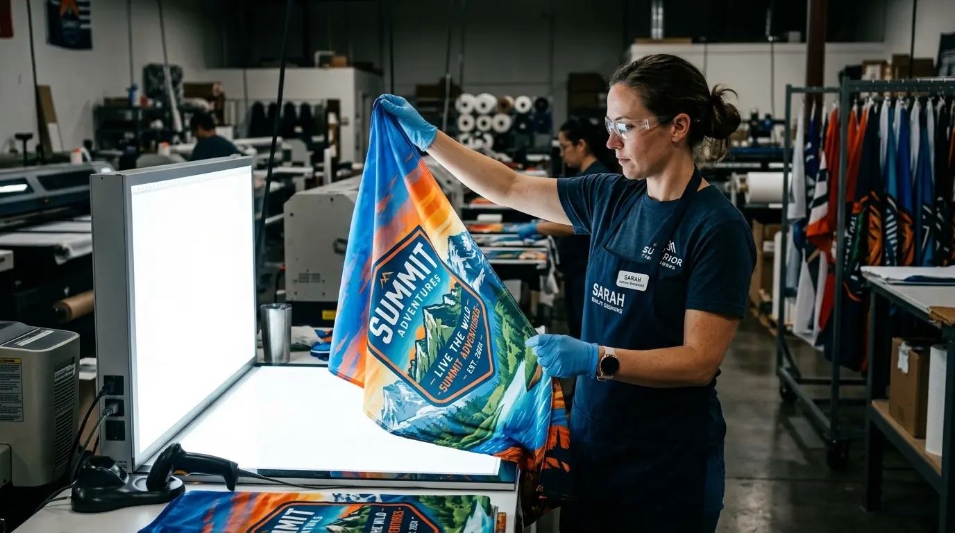
The most useful quality check you can do before placing a bulk flag order is request a single production sample — not a digital proof, not a color swatch, but an actual flag produced on the same equipment and materials that will run your full order. Digital proofs show design accuracy. Production samples show process accuracy. They are not the same thing.
Color banding — visible horizontal lines across gradients — usually points to clogged printheads or resolution below 300 DPI. Ghosting, as covered earlier, traces back to moisture, pressure inconsistency, or premature paper removal. Uneven saturation across the flag surface often means the transfer paper's coating was inconsistent within the roll. These are all process problems, not design problems, and they only show up on actual printed fabric.
Color Banding
Clogged printheads or resolution below 300 DPI
Ghosting
Moisture in fibers, pressure inconsistency, or premature paper removal
Uneven Saturation
Inconsistent transfer paper coating within the roll
Color Shifts
Wrong ICC profile or unconverted CMYK file
A few things worth checking on any sample flag: hold it up to strong light and look for uneven areas where dye penetration varies. Run your hand across the surface — sublimated fabric should feel identical to unprinted fabric, with no texture change, no stiffness, no raised edges. If you can feel where the print is, the process was not done correctly. Wash the sample once in cold water. Properly sublimated polyester should show zero color change after a single wash. If colors shift or fade, either the temperature was too low, the dwell time too short, or the ink quality is substandard. These quality standards apply whether you are ordering custom corporate flags for a brand activation or custom national flags for an official event — the production process must deliver the same consistency either way.
From Understanding the Process to Making Better Decisions
Knowing how dye sublimation works on flag fabric changes how you evaluate suppliers, approve samples, and set expectations for finished products. The process is straightforward — file preparation, transfer printing, heat press, cooling — but each stage has specific failure points that only show up in the final product if you are not watching for them.
If you are ordering custom flags for the first time, start with the file. Confirm RGB color mode, verify resolution at print size, and request a production sample before committing to a full run. Ask your supplier what press temperature and dwell time they use — a credible manufacturer will answer without hesitation. If they cannot tell you, that tells you something too. Reviewing how custom flags are made from start to finish gives you the full picture of what goes into a quality order before you commit.
If you already have a supplier but keep getting inconsistent results, work backward from the defect. Faded colors point to temperature or dwell time. Ghosting points to moisture or pressure. Color shifts point to ICC profiles or a CMYK file that was never converted. Knowing where each problem originates is the fastest way to fix it — or to determine whether your current supplier can fix it at all. When evaluating whether the results match what you paid for, comparing against what custom flags typically cost at different quality tiers helps calibrate expectations on both sides.
Related Articles