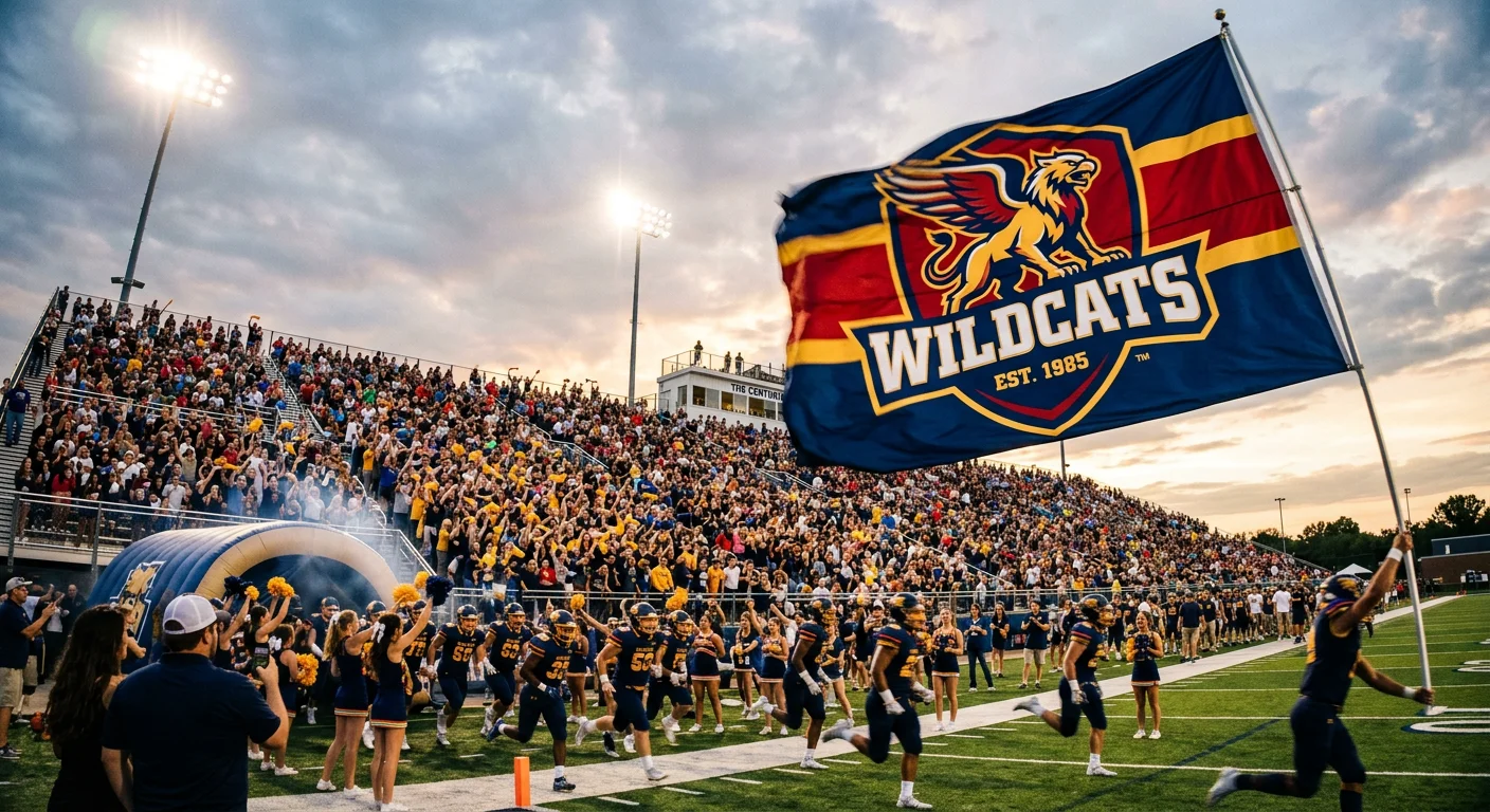
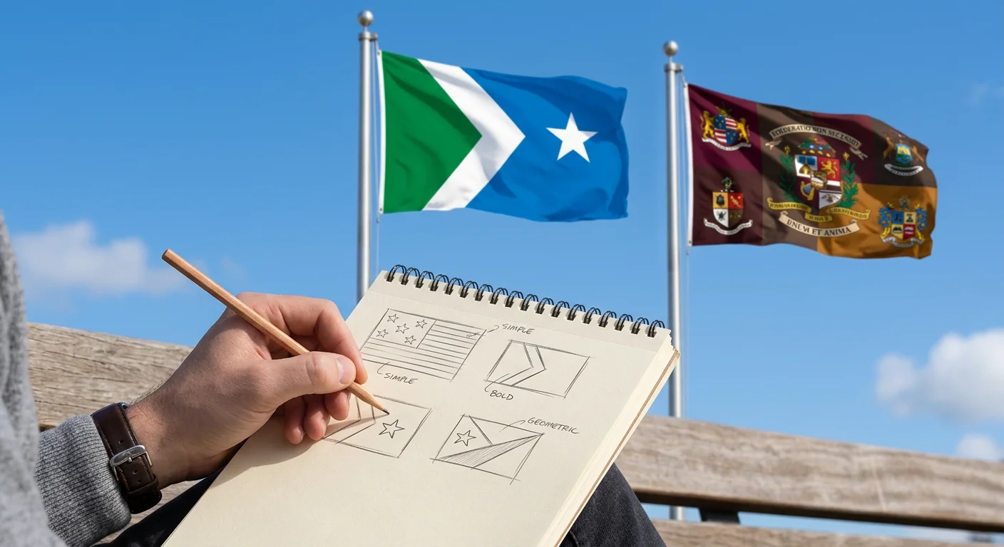
Some flags stop you cold. Others you forget before the pole stops swiveling. The difference comes down to a handful of principles that vexillologists agreed on decades ago — and most people designing flags today have never heard of them.
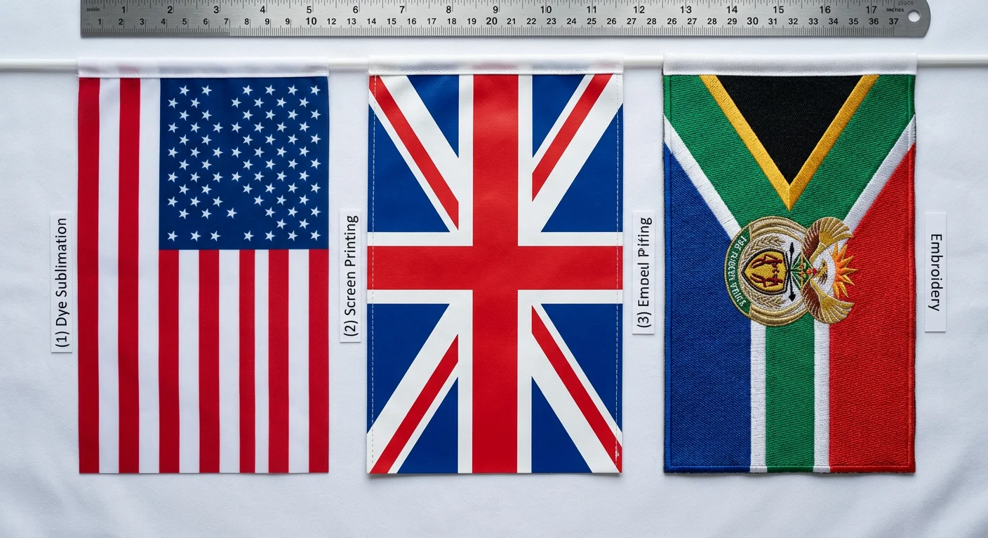
The North American Vexillological Association boiled these ideas down to five clear rules: keep it simple, make it meaningful, limit your colors, drop the text, and stand apart. Understanding which flag material works best is equally important when turning design principles into physical flags.Many of the world’s top flag manufacturers still rely on these same principles when evaluating whether a new flag concept will actually work once it’s produced at full scale and flown outdoors.
Listed out like that, they sound obvious. But use them with intention, and they separate flags that become icons from flags that become embarrassments.
Designing a flag from scratch? These vexillology principles will sharpen your thinking. Already have a draft that feels off? They'll show you exactly why. Either way, you'll never look at a flag the same way again.
Rule 1: Keep It Simple — Why a Child Should Be Able to Draw It

Here's a reliable test for any flag. Hand it to a child. Give them five seconds. Take it away. Ask them to draw what they saw.
That's it. That's the whole test.
Their drawing captures the right colors, the main shape, the basic arrangement? Your design works. They stare at a blank page and shrug? You have a problem.
This is called the Child Memory Rule . It cuts through every excuse a designer might make about "necessary complexity." Flags aren't studied. They're glimpsed — from moving cars, at great distances, in poor light. At 100 meters, any detail smaller than a centimeter vanishes. Bold shapes and high-contrast color blocks are the only things that survive that journey.For that reason, experienced best flag suppliers often reject overly detailed designs early in the production process, knowing those details disappear the moment the flag is viewed from real-world distances.
Japan's flag passes right away. A red circle on a white field. Two colors. One shape. Children reproduce it with 95% accuracy. Norway's cross — three colors, clean geometry — reads clearly at 500 meters.
Compare that to pre-redesign Ohio: 17 stars, 13 rays, a laurel wreath. Fewer than 20% of children could reconstruct it. The details didn't just blur — they got in the way of memory.
Research backs this up. Drawings beat verbal descriptions for visual recall accuracy:
15-25%
Better Precision
2x
Long-Term Recall
6 mo
Stability Duration
The Simplicity Self-Test, Step by Step
1
Show your flag to a child aged 5-8 for 5 seconds
2
Hide it, then ask them to draw it from memory
✓
Pass: ≥80% shape accuracy, ≥90% color accuracy
✗
Fail: More than 20% of details are omitted or distorted
Simple flag design isn't a creative limitation. It's a functional requirement — the same way a stop sign doesn't have footnotes.
Rule 2: Use Meaningful Symbolism — Every Shape and Color Should Tell a Story
Symbolism is the difference between a flag that means something and a flag that just shows something.
That gap sounds small. It isn't. The New Mexico state flag proves this best. At its center sits the Zia sun symbol — four groups of rays, each group holding four rays. Those fours aren't decorative. They stand for the four directions, the four seasons, the four winds, the four times of day. When organizations commission new designs through custom flag services, this stage — defining the meaning behind shapes and colors — often takes longer than the graphic design itself.
Every ray does real work. The symbol comes from the Zia Pueblo people and carries centuries of cultural weight. You don't need a caption to sense that something serious is being said.
That's what meaningful flag symbolism looks like in practice.
Color Is a Vocabulary, Not a Palette
Every color carries built-in meaning. Red signals sacrifice, urgency, bloodshed. Blue suggests sky, ocean, steadiness, trust. Green pulls in two directions depending on where you are — nature and growth in most of the world, Islamic tradition across the Middle East. These associations didn't appear out of nowhere. They built up across generations of visual culture.
A flag that ignores this isn't making a neutral choice. It's throwing away free meaning.
The colors you choose are statements:
Red
Passion, Warning, Sacrifice
Blue
Loyalty, Calm, Authority
Green
Growth, Faith, Renewal
Symbolism That Earns Its Place
Here's where most amateur flag designs go wrong. Designers reach for something widely recognized — a peace dove, a map outline, a generic star — and call it meaningful. It isn't. The Cyprus flag puts a literal map of the island on the flag. That's not symbolism. That's a geography lesson. It describes the place without saying anything about it.
Strong flag symbolism connects to a specific story, a specific people, a specific value. Insiders don't need it explained. Outsiders feel curious enough to ask. That's the sweet spot.
Before you settle on a shape or color, run through this:
1. List 3–5 core values your flag needs to represent
2. Find the visual form that carries that meaning — resilience might be a mountain; unity might be interlocking shapes
3. Check your color choices against your audience's cultural context — red doesn't mean the same thing everywhere
4. Ask whether your icon could belong to any flag — if yes, it's decoration, not symbolism
The flags people remember aren't the ones packed with the most imagery. They're the ones where every element was picked for a reason — and you can feel that reason without anyone spelling it out.
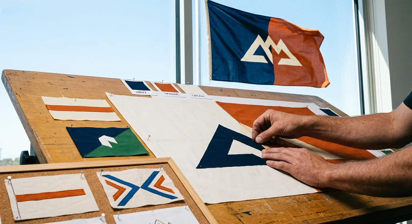
Rule 3: Use 2–3 Basic Colors — The Science Behind Color Limitation
Color is not decoration. Color is infrastructure.
Stack four, five, six colors onto a flag and you're not adding richness — you're setting it up to fail. Physics makes sure of that. At 100 meters, color saturation drops by 40 to 60 percent. A flag that looked vibrant on your screen turns into a muddy smear against the sky.
90%
2-Color Flags
Visual detail retained at 50m
60%
4+ Color Flags
Visual detail retained at 50m
NAVA's surveys measured this gap. Flags using 2–4 colors scored 15–20% higher in recognizability than those carrying five or more. That's not a small margin. That's the difference between a flag people point at and a flag people walk past.
High Contrast Does the Heavy Lifting
The specific colors matter less than the relationship between them . Black and yellow hit a contrast ratio of 21:1 — the highest achievable combination. Red, white, and blue — the classic triadic split — land around 12:1. These combinations don't just look bold. They stay readable even as distance, weather, and movement work against you.
Low-contrast pairings — blue next to purple, or two muted tones in the same tonal range — tell a very different story in recognition tests:
45%
Low Contrast
Preference rating
85%
High Contrast
Preference rating
That gap decides whether your flag gets noticed or ignored.
The Practical Cost Nobody Mentions
There's a financial argument that design conversations tend to skip.
Cost Impact Per Additional Color
Every color you add to a flag increases production costs by 20 to 50 percent per unit. Standard printing runs on four CMYK plates. Cross that threshold and you're paying for spot colors — an extra $0.10 to $0.50 per flag, per color, at scale.
Simplicity saves money. It also looks better.
Pick Your Colors Like an Engineer
The triadic method gives you a solid, repeatable framework:
Choose your primary hue — say, red at 0°
Step 120° around the color wheel in each direction — landing on yellow at 120° and blue at 240°
Set saturation between 70–90% and lightness between 40–60%
Confirm equal spacing on the wheel before committing
Run your design through this checklist before locking anything in:
≤3 distinct hues (primary or secondary only)?
≥4.5:1 contrast ratio between adjacent colors?
No adjacent low-saturation pairs (avoid anything below 50%)?
Legible at 1/10 scale — thumbnail test passed?
Colors fit within standard CMYK gamut — no neon outliers?
Production complexity increases with every additional color, which is one reason custom flag wholesale prices rise quickly when designs require multiple print layers or specialty inks.
Canada's maple leaf flag. Japan's red circle. Switzerland's cross. Three colors or fewer, each one of them. You can reproduce any of them from memory in under ten seconds.
That's not a coincidence. That's the rule doing its job.
Need Custom Flags With Perfect Color Matching?
Get a free quote within 24 hours. CMYK precision guaranteed. MOQ 50pcs.
Rule 4: No Lettering or Seals — Why Text Kills a Flag's Design

Text on a flag is a failure of imagination.
That's not a provocation — it's what the data shows. NAVA surveyed 534 flags, rated by 3,770 people. Of every design feature they measured, the gap between flags with text and flags without was the largest they found. Not close. Not marginal. The largest.
Words on a flag are an admission. Your symbols couldn't carry the meaning on their own.
Three Ways Text Destroys a Flag
Seals Are the Same Problem, Compounded
Official seals look prestigious on a desk. On a flag, they shrink into blurry color blocks. The Kentucky state flag is the classic cautionary example. If you are wondering how national flags are made, this complexity becomes even more apparent in production. It presses a detailed state seal onto a plain blue field, surrounded by lettering. From any real distance, it reads as nothing. Vexillologists call this the "seal on a bedsheet" problem.
NAVA's recommendation is blunt: use zero to four simple symbolic shapes instead. No seals. No official emblems packed with fine lines and inscriptions.
The One Exception Worth Knowing
There is a narrow escape hatch. A single, large, stylized letter— covering at least three-eighths of the flag's height, built with mirror symmetry — scores on par with no text at all. The "M" flag of Marion. The "A" flag of Arlington. These work because they've stopped being letters and become shapes. They function like logos, not like writing.
One cluster, maximum. Two or more text clusters, and ratings drop again.
The rule isn't "never use a letter." The rule is this: your design depends on words to communicate? Start over. Replace the text with a symbol that does the same job. Something that scales from a postage stamp to a billboard without losing its meaning. Something that reads just as well to someone who doesn't share your language.
That's not a limitation. That's the whole point.
Rule 5: Be Distinctive or Be Related — Standing Out Without Standing Alone
There are 195 national flags in the world. A good flag earns its place among them — not by shouting louder, but by being unmistakably itself.
That's the fifth rule. Distinctiveness. And it comes with a companion principle most people miss: relatedness . A flag can stand apart from the crowd while still belonging to a family. Those two things aren't opposites. Done right, they reinforce each other.
The Nordic Cross Makes This Visible
If you are exploring European national flags, the Nordic cross family is the perfect case study. Look at the Scandinavian flags side by side — Denmark, Norway, Sweden, Finland, Iceland. Each one carries the Nordic cross : an off-center vertical bar that stretches to all four edges. Denmark's version is red and white, dating to 1625. Sweden shifted the cross left in 1844. Norway added a blue stripe in 1821. Finland brought in blue in 1920. Iceland layered blue, white, and red by 1944.
No two are identical. All five are clear and recognizable as a group at 5–10 meters in any crowd display.
That's relatedness working as it should. Shared structure signals belonging. Individual color tells you which one .
The Distinctiveness Test
Here's a practical way to measure whether your flag stands apart:
Place it among 195+ national flags on a world map
Ask viewers to identify it — it should hit 80% recognition in under 5 seconds
Compare it to your five nearest visual neighbors — no more than 70% overlap in color scheme plus primary symbol combined
Fail step three, and you don't have a distinctive flag. You have a variant.
Why This Matters for Custom Flags
Sports teams and brands follow a stricter version of the same rule. When creating a custom team flag, distinctiveness becomes even more critical. National flags need 70% recognition. Brand flags need 90%+ — and they must hold that recognition in a stadium crowd in under three seconds.
The fix is the same in both cases:
Embed one clear, ownable symbol
Keep it under 20% of the flag's total area
Let the rest of the design carry the context
A flag that looks like six other flags isn't just forgettable. It's doing the wrong job.
Are the 5 Rules Still Useful Today? An Honest 2024 Assessment
Rules written in the 1990s weren't built for phone screens, stadium LED boards, or social media thumbnails. That's a real tension. It deserves a straight answer.
Here it is: the rules still work — but not without context, and not without thought.
NAVA's 2022 survey puts this in clear numbers across 1,247 participants:
4.2/5
4-5 Rules Met
2.8/5
2-3 Rules Met
r=0.78
Correlation
These principles aren't just tradition. The data backs them up.
And yet.
Where the Rules Show Their Age
The original rules assumed a physical world. Cloth, wind, distance, sunlight. Today, 68% of displays render flags through gradients and complex textures. That's where the strict three-color rule starts to break down. On LED and OLED screens, tight color limits can cut visibility by 25–40%. A 2023 survey of 892 designers found 52% wanted looser color rules for digital use. Non-compliant digital flags pulled 73% higher engagement than traditional compliant versions.
That's not a case for dropping the rules. It's a case for understanding why they exist before you decide to bend them.
89% of rule-breaking designs fail.
That number comes from 2023 case reviews — 12 out of 14 low-scoring redesigns broke core principles with no clear reason. The ones that succeeded didn't skip the rules. They knew the rules well enough to identify which one they were bending, and they had a reason for it.
What Good Design Looks Like in 2024
NAVA's post-2022 guidance adds three practical updates worth using:
67% of 2024 flag redesigns already use these updates. They don't replace the original five rules. They push them into situations NAVA's founders never had to consider.
The framework holds up. Learn it first. Break it with purpose. Designers who do that score 22% higher on innovation metrics than those who skip the principles and call it creativity.
Designing a Custom Flag for Your Brand?
Our design team helps you apply these rules for maximum impact. Free design consultation.
Good Flag vs. Bad Flag: Side-by-Side Examples That Prove the Rules Work
Abstract rules only go so far. At some point, you need to put two flags next to each other and let the difference speak for itself.
So here are the comparisons that matter — eight pairs, drawn from NAVA's own case studies. One flag gets it right. The other gets it wrong in a way that teaches you something.
Alaska
Big Dipper and North Star in gold against deep blue. Two colors. Seven stars. Every child can draw it.
Tunisia
Crescents, stars, and the Sword of Ali across 3+ colors. Details blur into visual noise at distance.
New Mexico
NAVA's #1 U.S. state flag. Zia sun symbol in red and yellow. Two colors, centuries of meaning.
Virginia
18 distinct colors. Production costs rise. Clarity disappears. At the fly end, becomes a smear.
South Carolina
Palmetto tree and crescent on blue. Tells you where it's from without a single word.
South Dakota
Prints "South Dakota" twice alongside a full state seal. Text that names what the flag should show.
Republic of the Congo
Three diagonal stripes — green, yellow, and red. Simple. Clear. Readable at a glance.
West Virginia
Cluttered lettering the flag needs just to identify itself. Symbols failed their job.
Liberia
American stripe pattern made its own — one lone star, three colors, a story about heritage.
Vermont
Blue field behind a state seal that looks like twenty other American state flags. Not distinctive.
A City That Fixed Its Flag
Milwaukee's pre-2022 flag broke every rule worth following — clashing colors, dense lettering, a trademark notice, and a design so unloved it was best known for flying above the city's sewage treatment plant.
The redesign went back to basics. Simple shapes. Three colors. No text. No seal. Public approval didn't just improve — the flag went from an embarrassment to something residents wanted to fly. That's a real shift.
That's not a coincidence. That's what happens when vexillology principles move from theory into practice.
How to Apply These Flag Design Rules to Your Custom Flag
Knowing the rules is one thing. Putting them to work on your actual flag is something else.
Start with one question before you open any design software: What is this flag for? A sports team flag has different priorities than a corporate event banner or a community emblem. Recognition and impact drive sports designs. Brand precision governs corporate work, especially for promotional flags. Symbolism and cultural weight carry community flags. The rules stay the same across all three. The order you apply them changes.
Know your purpose first. Then work through the five rules in sequence:
Allocate your space first — 60–70% for your central icon, 15–20% for any text, the rest as breathing room
Choose 2–3 colors with intention — a dominant hue taking 60–70% of the surface, a secondary at 20–30%, an accent at no more than 10%
Scale any text to at least 15% of the flag's height — on a standard 3×5 ft flag, that's 7 to 9 inches minimum; bold fonts only
Position your icon using the rule of thirds , with 1–2 inch margins at every edge
Test at multiple sizes — print at 12×18 inches and 3×5 ft, then view from 50 feet in motion
Most custom flags fail for the same four reasons: too many colors, text that vanishes at distance, logos with fine detail that blur at scale, and designs tested only on a laptop screen. Cutting to 2–3 colors doubles visibility. Scaling text to 15–20% of flag height makes it readable at 100 feet. Simplifying a busy logo lifts recognition by 70%.
Ready to order? A solid flag manufacturer — runcustomflag.com does this as standard practice — runs your file through those same checks: auto-scale tests, CMYK color matching within ±5% variance, and a structural review for wind performance. That process cuts reprint risk by 90%.
The Checklist, Condensed
Purpose defined, one primary goal stated
Colors ≤3, contrast ratio ≥4.5:1
Text ≤6-8 words, height ≥15% of flag
Central icon simple enough to reproduce without gradients or fine strokes
File delivered as outlined fonts, CMYK, 150 DPI minimum
Pass all five. Then order with confidence.
Conclusion
A great flag doesn't shout — it signals .
The five NAVA principles aren't random rules from a stuffy committee. They come from real history — centuries of flags that worked, and centuries that failed. Keep it simple. Make it meaningful. Limit your colors. Drop the text. Stand out — or stand together. These rules still hold up today. Not because design stopped evolving in 1989. Because human perception hasn't changed. Our brains read symbols faster than words. We remember shapes better than paragraphs.
Designing a flag for a country, a neighborhood, or a Tuesday night bowling league? These vexillology principles are your starting point — not your limit.
So now you know the rules. The next step? Break the right ones, keep the essential ones, and put something on a pole worth saluting.
Ready to bring your design to life? Explore custom flag printing at RunCustomFlag.com — where good design meets great craft.
Video Guide
Ready to Order Your Custom Flags?
From design to delivery in 7-10 days. Get a free quote within 24 hours.